Archive for Creative

QR Code Obsession

QR Code Obsession

QR Codes are cool. I agree. I’ve been talking about them in digital media presentations for about three years now. I like them! I think they have a ton of possibilities. But, for the love of Pete, we’re becoming obsessed with QR codes. They’re the shiny new toy. Everybody wants to use them. But they are being used stupidly. Ignore the fact that smart phones only have about a 30% market penetration in the US. Ignore the fact that only like 10% of internet traffic comes from mobile phones. Ignore the fact that the people that do have smart phones do not all have scanners nor do they know how to get/use one. People are being just plain non-strategic and impractical. I think there are some cool ways and some lame ways to use QR Codes. Here goes:

  1. Cool Way: On food packaging. I think it’s great when a box of food has a QR Code on it and scanning brings you to a video of how to prepare a recipe, or a list of ingredients needed to make a recipe. That gives value. I’m going to tag “Recipe Book” on to this example. It’s too similar to make it its own. But a cookbook should be full of QR codes that download a tutorial video for preparing a dish.
  2. Lame Way: On your website. There is almost NO REASON you should ever have a QR Code on your website. It especially infuriates me when the QR code brings me to your homepage or another page in your site. I’m already there! Just give me a link. That’s ridiculous. Yet I see it time and time again. Stop putting QR Codes on your website!
  3. Cool Way: Selling a house. I like this idea. A QR Code next to an ad for a house, or on the sales sign out front. Scanning brings you to a virtual tour and/or information about the house (the MLS listing, etc), and the Realtor to contact to make arrangements to see the house in person. Let’s get rid of those crappy, water-soaked, black & white photocopies that sit in that plastic bin.
  4. Lame Way: In an email blast. OK, this is really similar to the website one, but it’s equally as lame. Do not make me scan something that I can just click. Don’t put me through all that effort when I could just click a link. These seem like ways to use QR Codes just to use them.
  5. Cool Way: Scavenger Hunts. I think this is actually kind of fun. QR Codes can be posted or hidden in various spots and finding one reveals a clue (video or photo or text or something more interactive) to the location of the next clue.
  6. Lame Way: On clothes and/or name badges. I know that some people think that printing these on shirts, scarves, hats or name badges at conferences is cool. I don’t. Yeah, people could scan and get your information. OR, they could talk to you like a human being if they’re going to be that close to you.
  7. Cool Way: Next to artwork or items in a museum. People can scan to get more information about the artist, the item the history behind it, etc. I think QR Codes are really applicable in these situations where it would be visually disturbing and impractically to have an enormous wealth of information on the wall. This could apply to art galleries, museums, zoos, theme park lines (God, they’re long and dull!). This provides people with curiosity a way to really dive into something they’re interested in.
  8. Lame Way: Tattoos. Really? That’s just stupid. What if this QR Code doesn’t last? What site or resource are you sending people to? Just a really bad idea to tattoo a QR Code on to your body. Get a tattoo of a unicorn playing checkers. It’s timeless.
  9. Cool Way: Assembly directions. Now, I never need to look at assembly directions because I’m a man and therefore naturally apt at assembling things. But, some people may be very confused by the ridiculously complex directions that come with some products. A QR Code could be stickered on the product in case the directions aren’t included, or link to a video that gives a really good step-by-step assembly tutorial.
  10. Lame Way: Outdoor billboard. Especially those on the side of the road/freeways. Do you really expect people to whip out their phone, pull up their scanner app and get the QR Code snapped? Besides being extremely dangerous, you don’t have the time to make that happen. That’s why you typically get 7 words on a billboard. There’s no time for anything more. There’s certainly no point in putting a QR Code on a billboard.
  11. Cool Way: Conference mobile app. I actually just experienced this one not too long ago. Scanning the QR Code downloaded an app to my phone that was specific to the conference with a full schedule, options to add sessions to my personal calendar, maps, exhibitor information, etc. It was actually really valuable and a practical use since an application went to my phone.
  12. Cool or Lame (you decide): Tombstones. I actually kind of think this is cool. I was surprised at how many people have a QR Code on their tombstone. Scanning would bring you to a site about the person, maybe video, photos, etc. Thoughts on this one? Is putting a QR Code on a tombstone taking it too far?
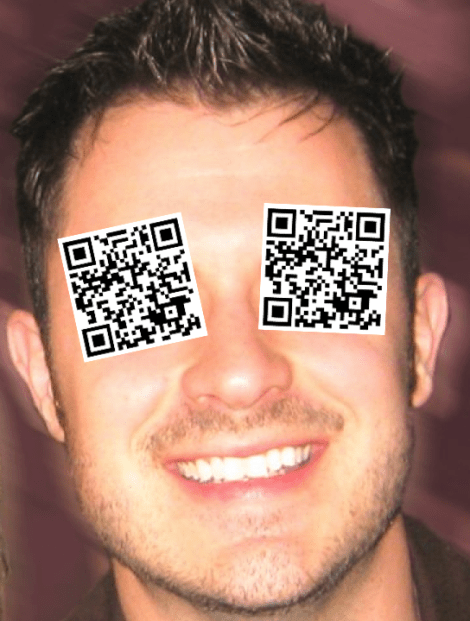
Here’s the bottom line for me: use these strategically and don’t just use a QR Code to say you’ve used it. Give value to your clients and visitors. It’s enticing, I know, to want to slap a QR Code on everything because they seem so freaking cool! But, show some discipline before I need to schedule a QR Code intervention.
Advertisement

Comments (5) »

Cheetos Setting a New Standard for URLs?

There was a point, years ago, that it became a standard practice to add your company’s URL to the final slide of your TV commercial. There’s been an evolution of how that URL is displayed…

http://www.visitmywebsite.com

http://www.visitmywebsite.com

visitmywebsite.com

Now check out how Cheetos has decided to change the game even more. What do you think? I kind of like it!

Comments (2) »

The Effect of the FTC’s Testimonial Disclosure Rule Change

About a year ago, the FTC updated its guidelines on testimonials. I wrote a post about it on my other blog (for work) if you’d like to read that article. The highlights of the guideline updates were around transparency of results and testimonials. The updates included more guidelines around revealing any “material connection” between advertisers and endorsers. In other words, if the endorser received money or any other kind of payment for their endorsement, it needs to be disclosed.

This past week, I noticed the execution of these guidelines on a couple of TV commercials. Fairly interesting. This first one was the most interesting to me. It was an advertisement for a car (I don’t recall which one). The story line was essentially a couple talking about their future together and how this car was going to be a part of that future, etc. But that’s not the interesting part. The interesting part is the disclaimer line: Individuals were remunerated. What the hell does that mean? I’m probably just a big dummy, but I didn’t know what that statement meant. And I figure most people don’t.

Remunerated (verb)
Pay (someone) for services rendered or work done

reimbursed, paid, testimonial, remunerate

Yeah, it basically means that person got paid to say what they said. This seems fair enough at first. But then it also makes me wonder if this was a “real testimonial” and the people were thanked and given some money, or if they were just paid actors reading lines, parading as “real people.” Either way, they were paid. But I can’t tell if this was an actual testimonial or not. I feel like I’m being duped.

Here’s the other one – an ad for Vonage – explaining that these people shared their stories in exchange for an opportunity to appear on a television commercial. I think the description of this disclaimer is far less furtive. I think it’s much more honest and I applaud Vonage for their transparency in respecting the new guidelines. Don’t you?

testimonial, reimbursed, advertisement

Leave a comment »

Target Ads Target Lost Viewers

Regardless of your feelings on the quality of the season finale of Lost, I thought one of the standout performances was by retailer and advertiser Target. Target rotated through three, 15-second ads during the season finale of Lost. What made them stand out to me (and truthfully what made me stop fast-forwarding through the commercials) is that the ads started with footage from Lost. The ads were then tagged with a product and a price. The commercials were pretty funny – there was one where the smoke monster was searching through an empty camp, finding nobody. The punchline to the ad is a photo of a smoke detector sold at Target. C’mon, that’s funny!

I’ve included video of all three spots in case you didn’t see them. I like this trend of creating TV commercials that are relevant to the show that they air during – I thought these were brilliant, strategically. If you were familiar with Lost, you understood the commercial and got the payoff. I wouldn’t mind seeing advertisers make an effort like this in the future.

And a spoof for good measure…

Leave a comment »

Imagine Advertising with Creative Copywriting

photo by matt.hintsa via flickr

“Imagine more shoes than you could ever imagine.”

…rewind…

“Imagine more shoes than you could ever imagine.”

OK, that’s what I thought it said. That’s some of the worst copywriting I’ve ever heard. This was the lead-in line to a TV advertisement for Off Broadway Shoes. I’ll concede that perhaps the copywriters were trying to get attention by having this very confusing line. But, I think it’s simply not a good line. How do I imagine more shoes than I could ever imagine? I tried. I couldn’t do it. No matter how many shoes I imagined, I could never imagine more than I could ever imagine.

Bad line.

Off Broadway Shoes doesn’t have a version of this ad available to embed here on the blog. But they have it here on their website or here on Facebook.

Is it just me, or does anyone else think this is a bad line? Anyone think it’s a good line?

Comments (4) »

More on RSCVA Tagline

Hey all. Just a quick link to an article from the Reno Gazette Journal that talks about the RSCVA tagline that I wrote about last month. It shares some decent quotes/perspectives about the challenges of coming up with a good tagline, and a reminder that the tagline is only a small part of the branding. I also couldn’t agree more with the idea presented in the RGJ article that approval by a committee often leads to a watered-down, lame tagline, logo, brochure, TV ad, brand, whatever. Try to avoid making eye contact with the comments on the article – they’re not overly impressive.

Leave a comment »

RSCVA Reveals Their Branding Campaign

The Reno-Sparks Convention and Visitors Authority (RSCVA) revealed their branding campaign to their Board this morning for approval.

For the past year, the RSCVA has been conducting research to best understand their target drive and fly markets (mostly Bay Area/Sacramento/etc for the drive markets, and southern California for the fly markets). They identified a couple of segments of those markets that made the most sense to target with a campaign – those who hadn’t been to the Reno/Sparks/Tahoe area before, and those who had been here before, but not for a while. Through their research, they discovered what we all pretty much already knew – these markets view the area as offering gambling exclusively. Astutely, the RSCVA recognizes that people will gamble once they’re here, but gambling alone is no longer enough to get them here.

For the past seven years (or so), the RSCVA has worked to position the Reno/Sparks/Tahoe area as “America’s Adventure Place.” While the area does offer a remarkable number of outdoor and indoor adventures, it was apparently too much of a disconnect for people to rip them away from visions of blackjack and divorce. Ultimately, it didn’t help the decline in visitors to the area for the past 11 years now.

The new brand positioning was described as “refreshingly offbeat.” It’s referring to the idea that the Reno/Sparks/Tahoe area is a little quirky, fun, unique and proudly unapologetic for being so. I think this brand positioning can work. When a small group of us were given a sneak peak at the positioning last week, I told Michael Thomas (Executive Director of Marketing) and Ellie Oppenheim (President/CEO) that I thought the positioning would resonate – it would just come down to execution. The positioning of being “refreshingly offbeat” is not untrue. I think we can all accept that this position accurately describes Reno/Sparks/Tahoe. And that’s what a brand needs to give it a fighting chance. It can’t be overly ambitious. It can’t be such a wide disconnect from what exists in people’s minds currently. A brand only exists in people’s hearts and minds. A brand is not a logo. A brand is not a tag line. A brand is composed of the images/thoughts/feelings that are conjured up in the hearts and minds of people when they interact with you/your brand. So, I applaud the RSCVA for understanding and really embracing the reality of one of the brand positions this area can really own. There are certainly others, but this is an absolutely attainable brand position that our region can own. But, again, it comes down to execution.

That being said, the RSCVA and their marketing partner (Mortar) presented some of the creative execution to the Board today to help them position Reno/Sparks/Tahoe as “refreshingly offbeat. Among the creative was a new logo for the area. Noticeably different than the previous logo, in that it graphically separates Reno and Tahoe. This was borne from research that the drive markets don’t buy in to the idea that Reno and Tahoe are one area. They view them as distinctly different. One of the people interviewed in RSCVA’s research said, “It’s not Reno-Tahoe any more than it’s SanFrancisco-Monterey.” Interestingly, the further you get away from Reno and Tahoe, the more people were apt to accept it as one region. In other words, folks in LosAngeles are cool with thinking of the area as Reno-Tahoe. So, the RSCVA didn’t want to abandon reference to Tahoe altogether, but needed to separate the two for the drive markets.

Old RSCVA Reno-Tahoe Logo

Old RSCVA Reno-Tahoe Logo

New RSCVA Reno Tahoe USA Logos

New RSCVA Reno Tahoe USA Logos

The new logo feels a bit retro for me, but I think it can grow on me. I don’t really love the “USA” part of the logo, though. I’m not sure why they felt that needed to be a part of the logo, but I’m hoping they had a good reason based in research.

Among the other creative execution revealed, was a few sample ads, and then the tag line of, “A Little West of Center.” Again, the tag line is not the brand, but it’s meant to serve as a memorable phrase that encompasses the brand positioning. I don’t adore the tag line, and the Board was pretty split on it, as well. In fact, the brand positioning was accepted by the Board, but they rejected the tag line, asking Mortar and the RSCVA to try again. Bummer. I’ve been in that position, where we excitedly present creative work to a Board, and some love it and others hate it. I’ll be interested to see what they come up with and how well the next round is received.

As I mentioned earlier, the success of this campaign will not be attributed to the logo and the tag line (the two things people put the most focus on), but rather the full execution of the brand campaign, which includes a number of integrated marketing communications components such as public relations, communication channel selection, engagement of locals (we ARE the brand in many ways), copywriting, using social media and word-of-mouth, and of course the infrastructure to come through on our brand promises of offering quirkiness and unique events. Stay tuned, folks. Oh, and visit Reno, Tahoe, USA : )

Comments (5) »

Living Well in a Recession – $3,000 T-Shirt

Stumbled upon this t-shirt today at Zazzle.com that reads, “Fuck the Recession. I’m Still Rich.” You may not have a problem with it, but I think this is an awful idea. Don’t get me wrong – I get the gag – based on irony. A t-shirt that says something like this is usually not actually worn by somebody who has money. That’s what I thought, until I saw the price tag. $3,325.00! Ridiculous. I thought maybe the price itself was a joke, but I added the item to my cart, and sure enough, it costs $3,300! 

Tshirt Front

Tshirt Front

Tshirt back

Tshirt back

$3,325 at checkout

$3,325 at checkout

Here’s my problem with it. When we’re in a “recession,” you should not (as an individual or a business or organization) show signs of living or spending opulently. It’s tacky. It’s insensitive. I guess I just don’t think it’s that funny or novel to spend $3,000 on a t-shirt in this economy. People are hurting. Genuinely hurting.

To waltz around with signs of spending money lavishly is really socially insensitive to me. There are some companies that are doing this – sending out postcards that are gilded, printing Annual Reports with ornamental and lavish features. Stop doing this! Granted, in my line of business (advertising and marketing), I wish clients were spending more money – but I think it makes such poor business sense. If you even look like you’re spending a lot of money right now, you will offend customers. I don’t care if you got a good deal. Perception is reality – if you look like you spent a ton of money, you spent a ton of  money. Be aware of the messages you’re sending.

Comments (4) »

What Does Your Blog Say About You?


Photo from joelogon

Photo from joelogon


Well, what does your blog say about you? More than you would think. Certainly spilling your brain on the page should reveal who you are, but there are also quite a few services that you can use to evaluate your blog, and in some cases its gender or its personality. Is it possible that your blog writing style could be very different from what you believe your personality and characteristics are? Sure, I think so. People can change their mentality when they write; they can change who they are.

Wordle.net is able to generate a word cloud that shows you which words you are using the most in your blog. This is not a tally list, but a visual representation of your most often used words. The words that are used most appear larger. It’s a nice visual snapshot of the words you use most.

Gender Analyzer uses Artificial Intelligence to read your blog and determine if it was written by a man or a woman. Behind the scenes, a text classifier hosted at uClassify.com has been trained on blogs written by men and women. A month ago, Gender Analyzer told me that my blog was written by a woman. However, I must have written about very manly things since then, because it now realizes that this blog is written by a man. And to keep it that way, let’s load this paragraph with some uber-masculine keywords: football, chicks, balls, beer, mustache, fight, piss, gun.

Typealyzer analyzes your blog to tell you what your Myers-Briggs personality type is. It also gives you a really cool visualization of a brain map that shows the part of the brain you’re using when you write. This blog (mikemywords.com) is an ISTP (Mechanic). The site’s description is this: The independent and problem-solving type. They are especially attuned to the demands of the moment are masters of responding to challenges that arise spontaneously. They generally prefer to think things out for themselves and often avoid inter-personal conflicts. The Mechanics enjoy working together with other independent and highly skilled people and often like seek fun and action both in their work and personal life. They enjoy adventure and risk such as in driving race cars or working as policemen and firefighters.

This is somewhat peculiar, because for years, my Myers-Briggs tests have shown that I am an ENFJ. An ENFJ (which you can read about through the hyperlink) is quite literally the opposite of an ISTP. In Myers-Briggs, you are an E or an I, an N or an S, an F or a T, a J or a P. So, ISTP seems to be the opposite of ENFJ. Again, perhaps proving the point that your “blog voice” may be quite different than your real self. 

This is something to be conscious of. Who are you when you are writing your blog? Who do you want to be when you are writing your blog? After looking at the word cloud, the gender and the personality of your writing – do you want to change the style of your writing to better fit who you actually are?

Comments (4) »

The Client Always Knows Best

Don’t interpret this as client-bashing. Most every client I have is wonderful, and many of them “get it.” However, over the years, I have been involved in meetings in which a perfectly great solution to a communication/marketing issue was reduced to mush after multiple rounds of client changes. I think that many of you can relate to this situation, and one video really captured this frustrating process. I know it’s been around for a while, but I just ran across it again, and it made me laugh.

Comments (1) »